How To Create A Quick Reference Guide

You've probably used a quick reference card or sheet for easy access to a condensed set of information, like grammar rules, foreign language expressions, software functions and similar types of content. An effectively designed quick reference card provides a concise way to organize information in a small space that is easy to use and read. It serves as a cognitive aid and is an effective way to support work performance.
Wikipedia calls it "a concise bundling of condensed notes about a specific topic."
I was recently hired to create a reference card for participants in a professional development program. The goal of the reference was to summarize a rather involved curriculum into two pages to be used as an online PDF document. Participants in the program needed a way to quickly locate the topics and assignments in order to plan for their busy lives.
During my design process, I realized it might be helpful to share the thinking, strategies and workflow that went into the creation of this product. My example quick reference is a fictitious one for an imaginary visual design curriculum. Note: creation is rarely a linear process, so assume that in the steps below, there was a good deal of iteration.
Step 1: Understand the audience
Understanding and empathizing with the audience is now standard advice for a reason. Prior to embarking on a design, I need to know why the reference card will help members of the audience. I need to know its purpose and how they will use it. It helps to gather use cases or imagine them—what are examples of situations when a person will use this reference?
Step 2: Gather information to be presented
In this case, I had to gather the different aspects of the curriculum to include in the card. As is typical, it was somewhat in flux, but this was an easy step.
Step 3: Categorize the information
Do you find that your instructional design brain can't help but categorize information? Mine too. By categorizing content, things begin to take shape. I know how many elements I'm working with and the dimensions of information that I need to include.
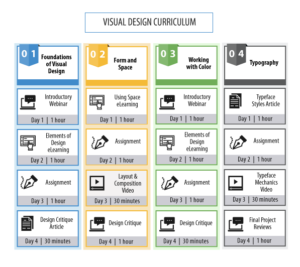
In the fictitious example I will show here, I need to lay out four weeks of curriculum. The dimensions of information include: weekly curriculum, sequence of instructional events, types of activity/media, topic, and average time to complete. The fascinating part is that a visual can compress information to fit all of this on one sheet!
Step 4: Research how others solved the problem
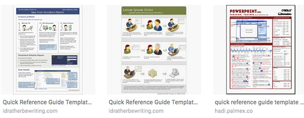
Before I sketch, I like to research how others have designed quick reference cards. There is no reason to reinvent a solution that someone has already figured out. Although I didn't expect to find something that would work for my unique situation, I find many advantages to researching other designs:
- I can see what works and what doesn't
- Viewing a range of designs is fuel for my creativity
- If I learn from an existing solution, it saves my clients time and money
There were many templates and designs to be found in Google Images.

Step 5: Sketch and conceptualize ideas
Now it's time for that sketch book and pencil. I like to let the free flow of ideas take over, without being judgmental at first. I think about what type of chart or diagram will best fit the problem?
Over time, I start to sketch for the most difficult scenario. For example, if one section of the curriculum has eight elements and another has four, how could that work within one diagram? I eventually selected three layouts.
Step 6: Select icons to represent categories
I used nounproject.com for icons. Other sites that have a good selection of vector icons are iconfinder.com and istockphoto.com. By downloading them in an SVG or EPS format, I was able to customize them with a vector graphic program. If customization isn't important, then finding icons in a PNG (bitmap) format will also work.
![]()
Step 7: Transfer sketches to a graphic program
I created a portion of each reference card design in Adobe Illustrator. These were rough prototypes. Decent enough to understand but without spending too much time to get things perfect.
During the process, I kept accessibility in mind. Although I used a different color to show the relationship between elements within each week, I also drew a rectangle around the related elements for those who may not be able to see the colors as I intended them.
Other programs that could be used for making a quick reference card are InDesign, PowerPoint, Inkscape (free) and Sketch.
Step 8: Review with client and select one design
Upon review and discussion, we all settled on one approach. The selected design left room for adding a few other elements if they were ever needed. The design compartmentalized each section of the curriculum in an easy-to-read layout.
Step 9: Improve the design through revision cycles
You've been through this a million times so, no need to explain. I would like to note that the feedback I receive from users is always immensely helpful and what I really care about. Positive feedback validates the design, requests to modify a design helps to improve it. There's no way to lose with user feedback throughout any design process.
Step 10: Quality check and finalize
During the finalize step, I conducted a thorough QA check. By reducing the view in Illustrator to see the entire page, I was able to find and correct alignment and layout inconsistencies. By magnifying the design in Illustrator, I was able to find and correct typos and to fix small details. The final output was a PDF format. Below is a sample quick reference card for an imaginary curriculum. Although it doesn't look like the real one, the general concepts are here.

Have you made a quick reference card or job aid? What was your process?
Get the latest articles, resources and freebies once a month
plus a Visual Design Checklist.

How To Create A Quick Reference Guide
Source: https://theelearningcoach.com/media/graphics/design-a-quick-reference-card/
Posted by: pursellthempailoved.blogspot.com

0 Response to "How To Create A Quick Reference Guide"
Post a Comment